

The New Neutral Palette: Beyond Beige and White Walls
Key Takeaway
- Neutral interior design has moved well beyond white walls and beige furniture into a richer territory of clay, sage, warm stone, and deep earthy tones.
- The shift is backed by global colour trend data: Pantone’s 2026 Colour of the Year is Cloud Dancer, a balanced white chosen to reflect a collective need for calm and clarity.
- A neutral palette doesn’t mean a flat or boring one. Texture, tone variation, and a considered accent strategy produce depth without complexity.
- Warm home interiors achieve their quality through layering, not through adding more colour.
- MJS Interior’s design process helps homeowners build a cohesive colour palette for their home before a single tin of paint is opened, grounding every choice in the home’s light, materials, and how the household lives.
Introduction
White walls were safe. Beige was sensible. For a long time, Singapore homeowners used neutral as a synonym for inoffensive, a way of keeping the home looking clean without committing to anything that might date.
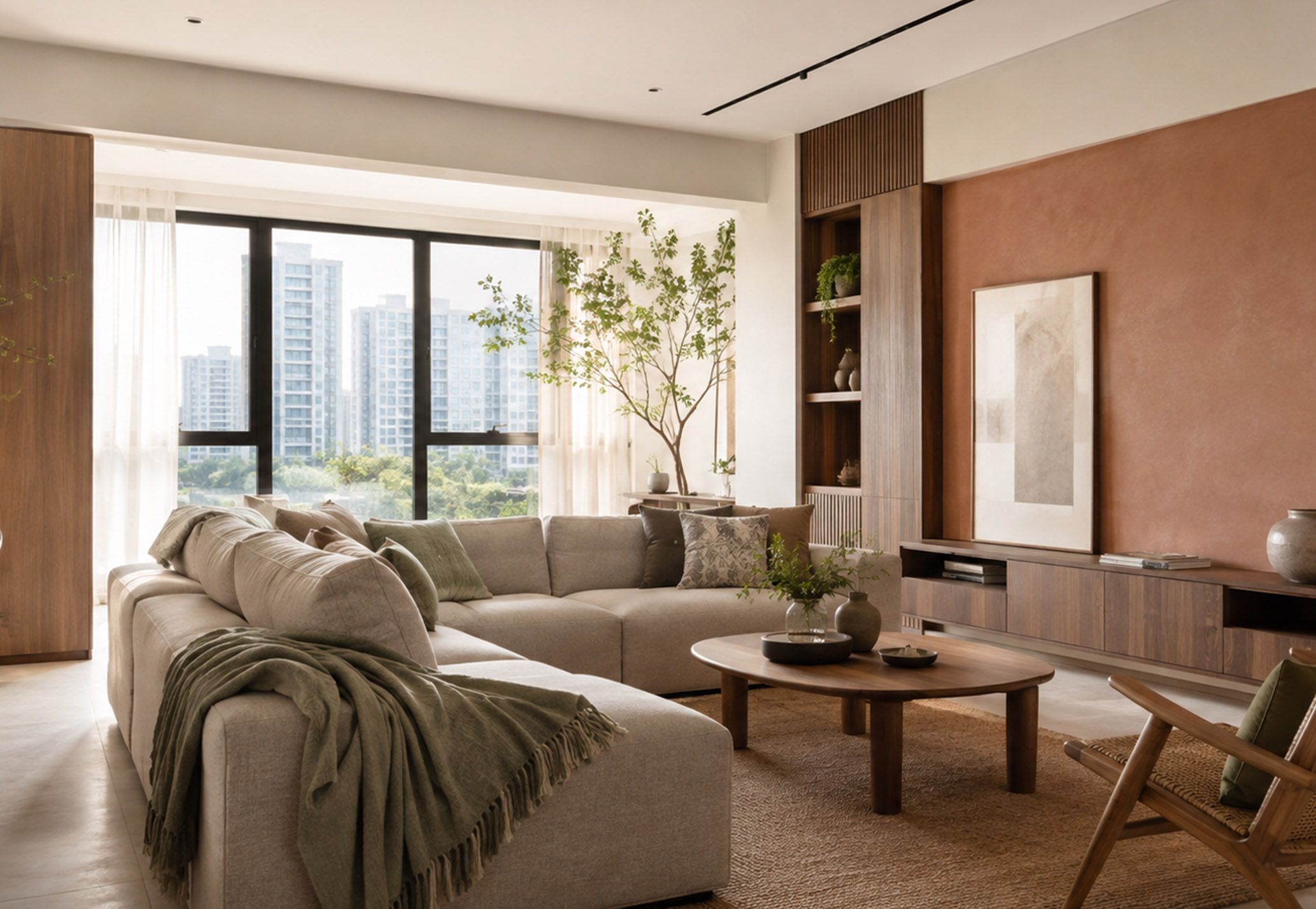
That version of designing with neutrals has shifted. The homes that feel most considered in 2026 are still anchored in calm, muted palettes. But the neutrals they use are richer, warmer, and more textured than the clinical whites and flat beiges of a decade ago. Clay-toned plaster walls. Warm greige cabinetry. Sage green accents. Limewash finishes that shift in the light. Deep earthy feature tones that hold a room without overwhelming it.
This blog explains how the neutral palette has evolved, what it actually involves in a Singapore home, and how to build one that holds together across rooms.
What Is Neutral Interior Design?
Neutral interior design refers to a colour approach that uses low-saturation, muted tones as the primary palette for a residential space. These include whites, creams, greiges, warm greys, clay, stone, sage, and earthy browns. Rather than making colour the focal point, a neutral palette creates a calm visual foundation that allows texture, light, and material quality to take centre stage.
A well-executed neutral palette is not colourless. It uses restrained, considered hues that work across different light conditions and don’t compete with the furniture, joinery, or the people living in the space.
Why Neutral Has Changed: The Move Away from Flat White
The all-white home had a long run. For much of the 2010s, white walls, white kitchen cabinetry, and light grey flooring became the default renovation palette across Singapore and most major cities. It photographed well. It felt modern. And it was easy to specify because the decisions were minimal.
The problem with flat white is that it reads as cold in most Singapore homes. Without sufficient natural light, which many HDB flats lack, cool white walls strip a room of warmth rather than adding space. Furniture and joinery look harder against white than against a warmer tone. The result feels clean but clinical, livable in photos but not always comfortable in person.
The industry has responded. Pantone’s global colour authority named Cloud Dancer, a balanced white with equal warm and cool undertones, its 2026 Colour of the Year, chosen to reflect a society seeking calm, clarity, and quiet. Before that, Pantone chose Mocha Mousse (a warm earthy brown) for 2025 and Peach Fuzz (a warm peachy neutral) for 2024. Three consecutive years of warm, grounded tones are not a coincidence. It reflects a genuine shift in how homeowners worldwide want their spaces to feel.
For Singapore homes, this shift is particularly relevant. Warm neutrals work better under artificial lighting, which most HDB flats and condominiums rely on heavily. They soften the hard edges of concrete ceilings and tiled floors. And they read as more considered than plain white because the homeowner has actually made a colour decision, even if that decision is still within the neutral range.
The new neutral is not about avoiding colour. It’s about choosing a colour that works quietly rather than loudly.
The New Neutral Palette: What It Actually Looks Like
The expanded neutral palette sits across several tonal families, each with a different character.
Warm whites and creams sit closer to ivory or off-white than pure white. Dutch Boy’s Melodious Ivory, noted by Apartment Therapy as a standout 2026 paint choice, combines hints of peach and yellow with a cream base to create a neutral that reads warm and grounded without tipping into yellow. In Singapore homes, a warm white at 2700K lighting produces a result that feels calm and residential, not institutional.
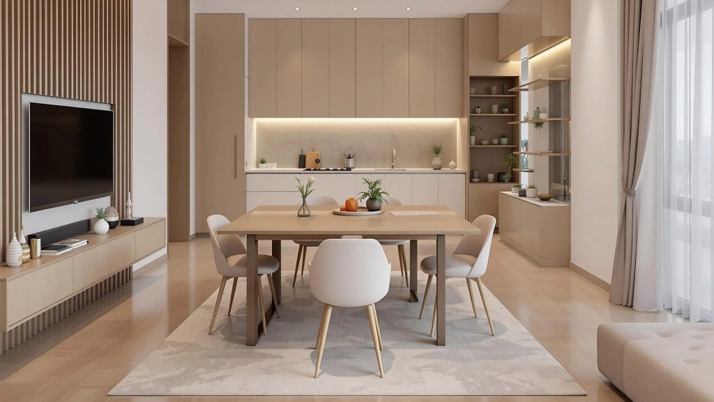
Greiges and warm greys occupy the space between grey and beige. They’re the most versatile tone in the neutral family because they shift depending on what they’re placed next to. Against warm timber, they read slightly cool and sophisticated. Against white joinery, they read warm and soft. A well-chosen greige on the main living walls is the single most reliable palette decision for a Singapore flat that wants to feel calm without feeling empty.
Clay and terracotta tones bring earthiness without drama. These work best on a single feature wall or as the dominant tone in a smaller room like a study or bedroom. Against warm white walls in adjacent spaces, a clay feature wall reads as intentional and warm without demanding too much attention.
Sage and muted greens have become a reliable neutral accent. Sage reads as cool from a distance but feels warm in person, particularly when placed next to natural timber or woven textures. In warm home interiors, a sage green cushion, curtain, or cabinetry panel adds chromatic interest without breaking the calm of the overall palette.
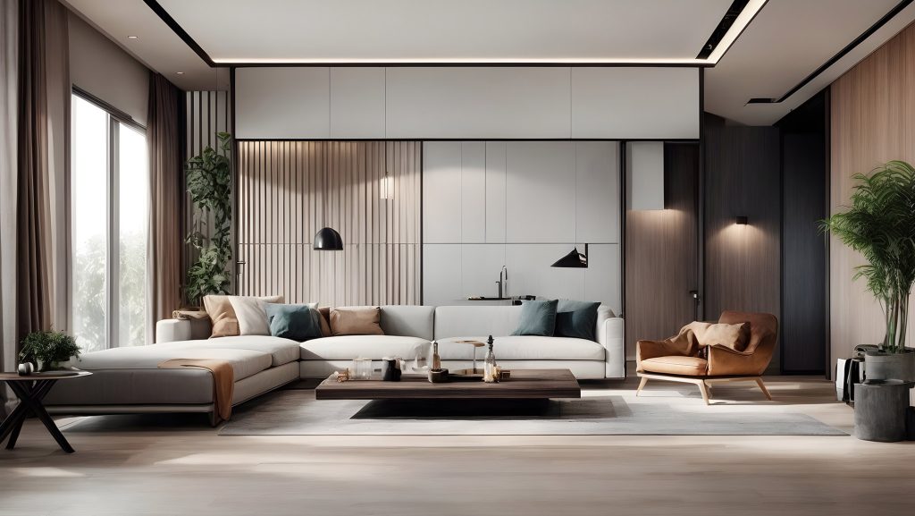
Warm stone and off-black anchor the deepest end of the new neutral spectrum. A charcoal TV wall in an otherwise pale living room, or deep stone-look flooring under warm cabinetry, creates the contrast that keeps a neutral palette from looking flat. These tones work as accents and should stay below 10% of the visual surface area.
How to Build a Colour Palette for Home That Holds Together
Most palette mistakes happen at the selection stage rather than on the wall. Homeowners pick three or four colours they like individually, then paint them in adjacent rooms and find the result feels fragmented. Colours chosen in isolation rarely form a coherent palette in context.
Getting a palette that holds together across rooms starts with tone, not colour. Choose one tonal family for the main living spaces, a warm neutral family or a cool neutral family, and stay within it throughout. Warm ivory, warm greige, and warm linen all belong to the same family. Mixing a warm wall colour with a cool grey floor and a neutral-white ceiling often produces visual tension that homeowners can’t name but can feel.
The 60-30-10 rule is a practical guide for applying that tonal family. As the MJS Interior guide to geometric interior design explains, 60% of the room should carry the dominant colour, 30% the secondary, and 10% the accent. In a neutral palette, the dominant tone goes on the walls and large joinery, the secondary tone appears in flooring and main upholstery, and the 10% accent is where a deeper or warmer tone earns its moment.
Lighting is the variable that most homeowners underestimate. A paint colour that looks warm and calm in a paint shop reads differently under 4000K cool white LEDs at home. Always test paint colours on the actual wall in the actual room under the actual lighting before committing. A warm clay that looks beautiful in daylight can read as muddy under cool artificial light, and a neutral greige that looks sophisticated in the store can look purple or pink on your specific wall.
MJS Interior’s design consultations include palette-building sessions that account for each room’s light conditions, the joinery materials being specified, and how the palette reads across the transition between rooms. The living room interior design guide on the MJS Interior blog covers how colour and material selection interact in Singapore’s most-used living spaces.
Texture: The Tool That Makes Neutrals Feel Rich
A neutral palette without texture is a flat palette. This is the distinction between a home that looks calm and considered versus one that looks unfinished or clinical.
Texture adds visual depth without adding colour. A limewash finish on a feature wall shifts slightly as the light changes throughout the day, giving the wall life without drawing attention. Fluted or reeded panels on cabinetry or a TV wall create a shadow line that adds dimensionality without pattern. A bouclé or linen sofa introduces tactile variation that the eye reads as warmth.
In Singapore homes, three or four distinct textures used consistently across the space produce the layered quality that characterises a well-executed interior. A rough-surface wall, a smooth joinery panel, a soft upholstered piece, and a natural fibre rug together create enough variation that the neutral palette reads as rich rather than empty.
The discipline is restraint. Too many competing textures produce visual noise in the same way that too many competing colours do. One anchoring texture per zone, everything else smooth and recessive, is the working principle.
For homeowners exploring how texture and palette work together across different aesthetic directions, the modern Scandinavian interior design guide covers how warm-toned neutral palettes with textured surfaces create spatial calm in Singapore’s compact residential environments.
Is a Neutral Palette Right for Your Home?

A calm, restrained palette suits any Singapore home where the goal is a space that feels cohesive and livable over time. It works in compact HDB flats where a unified palette creates perceived spaciousness. It works in larger condos where the neutral base lets furniture and artwork speak without visual competition. It suits homeowners who’ve been burned by trend-driven colour choices that dated quickly.
The right neutral palette isn’t the one that looks good on a screen. It’s the one that works in your specific home, under your specific lighting, with your specific joinery and flooring materials. Getting that selection right before renovation starts is where the quality difference is made.
Frequently Asked Questions
1. What makes a palette “neutral” in interior design?
A neutral palette uses muted, low-saturation tones such as whites, creams, greiges, clay, sage, and warm greys as the primary colour foundation. Rather than drawing attention through colour, the approach creates a calm background that allows texture, material quality, and natural light to shape the character of a room.
2. Is beige still considered a good neutral for Singapore homes?
Beige remains a valid neutral, but it now sits within a wider family of warm tones. Greige (grey-beige hybrids), warm ivory, and clay tones often perform better than flat beige in Singapore homes because they hold their character under artificial lighting rather than going dull or flat. The right choice depends on the specific room’s light conditions and joinery materials.
3. How do I choose home colours that work across rooms?
Choose a tonal family first, warm or cool, and stay within it across the main living spaces. Test paint colours on the actual wall under your home’s actual lighting before committing. Use the 60-30-10 rule: 60% dominant tone on walls and large joinery, 30% secondary on flooring and main upholstery, 10% for a deeper or warmer accent tone.
4. What accent colours work well with a warm neutral palette?
Earthy accents sit most naturally within a warm neutral base: deep terracotta, olive green, warm charcoal, and burnished brass all work without creating visual tension. Muted sage and dusty blue also work as cooler counterpoints that add chromatic interest without breaking the overall warmth.
5. How does MJS Interior help with palette selection during a renovation?
MJS Interior’s design consultations include palette-building sessions that account for each room’s light conditions, the joinery finishes being specified, and how colours transition between rooms. This prevents the common mistake of selecting colours that look right in isolation but don’t hold together across the home. Explore MJS Interior’s interior design and renovation services to see how this process works from the first consultation onward.
The shift in neutral interior design is not a trend in the usual sense. It reflects how homeowners have come to understand what makes a home genuinely comfortable to spend long hours in, and flat white walls don’t answer that question as well as a carefully chosen warm palette does. Richer, warmer, more textured neutrals produce homes that feel calm without feeling empty, considered without feeling designed for a photograph. Getting there requires the same discipline as any other palette decision: choose the tonal family first, test in context, layer texture to add depth, and let the accent do its work at 10% of the visual surface. MJS Interior’s team builds that process into every project from the brief stage onward, making sure the colour palette chosen before renovation starts is one that still works well on an ordinary Tuesday three years later. To start that conversation, explore the full range of interior design and renovation services at MJS Interior.