Color Psychology: How to Choose the Right Palette for Your Singapore Office
In the fast-paced business landscape of Singapore, the look and feel of your office can do more than impress clients—it can influence how your team works. One of the most powerful tools in shaping a productive, welcoming environment is color. Yes, color isn’t just about aesthetics—it has psychological effects that can impact mood, focus, creativity, and collaboration.
Regarding office interior design trends in Singapore, color psychology is becoming a key consideration for businesses that want to create thoughtful, people-centric workplaces. But how do you choose the right color palette for your office space? Let’s explore how different colors affect emotions and performance and how you can use that knowledge to design a more innovative, more intentional workspace.

Why Color Psychology Matters in Office Design
We often underestimate the subtle power of color in our surroundings. However, studies have shown that certain hues affect how we feel, behave, and think.
- Enhanced productivity
- Reduced stress
- Improved concentration
- Stronger brand identity
In a multicultural, diverse city like Singapore, where innovation meets tradition, integrating color psychology into office interior design can help businesses build a workspace that aligns with their company culture and employee needs.

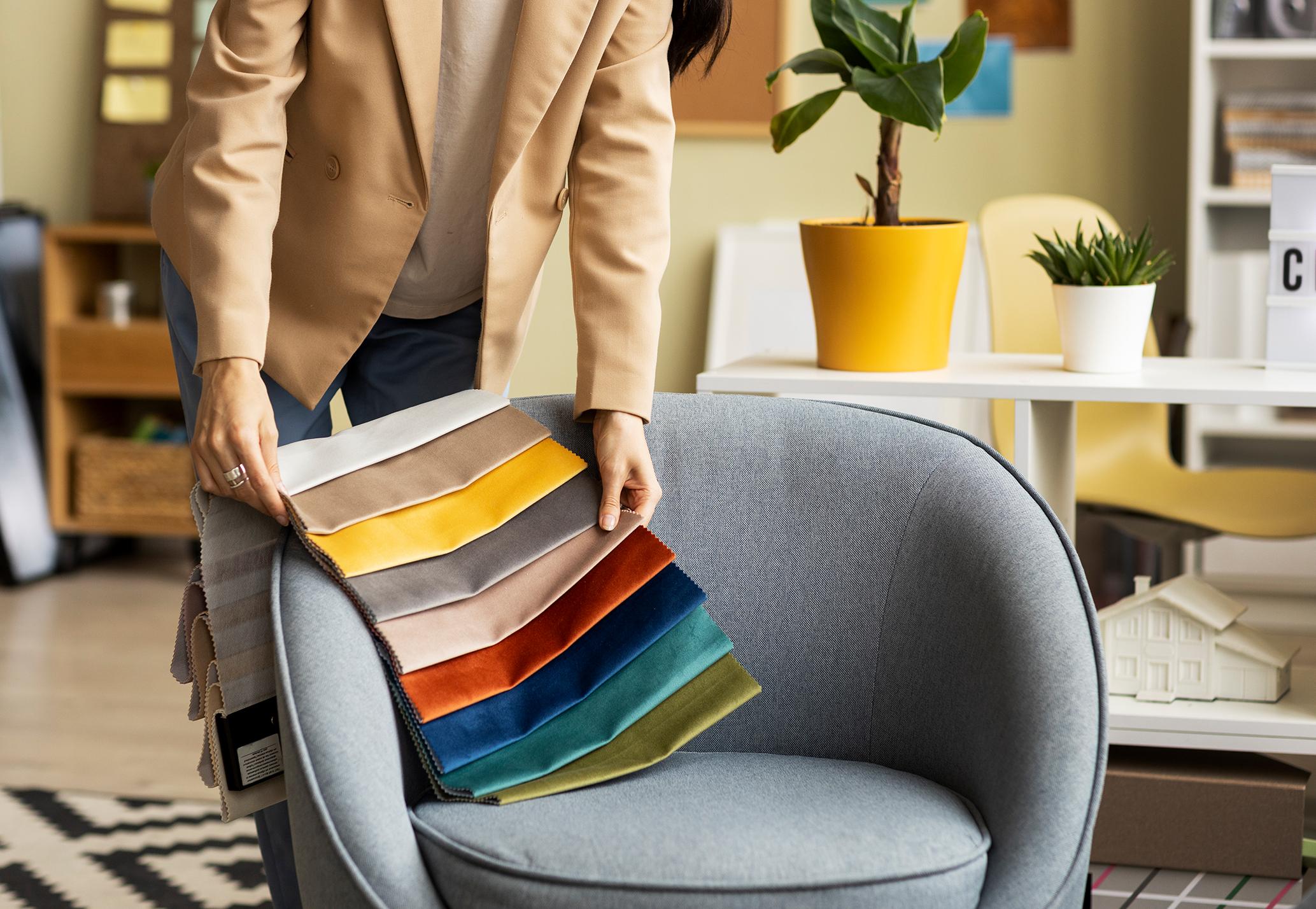
Understanding the Meaning of Common Office Colors
Let’s break down what various colors typically convey and how they might suit different areas of your office:
1. Blue – Focus and Calm
Blue is a favorite in many corporate offices because it encourages mental clarity and concentration. It’s ideal for high-focus areas like conference rooms, private offices, or workstations where deep thinking is essential.
Tip: Use lighter shades of blue for a calming effect or deeper tones for a more professional and serious atmosphere.
2. Green – Balance and Freshness
Green symbolizes balance, nature, and growth. It reduces eye strain, especially in offices with long screen time. Adding green elements—through wall color, furniture, or indoor plants—can help create a refreshing and calming environment. Green works exceptionally well in breakout areas or creative zones.
3. Yellow – Optimism and Energy
Yellow stimulates creativity and positivity. It’s the color of energy and happiness, making it an excellent choice for collaborative spaces or brainstorming rooms. However, it’s essential to use yellow sparingly. Too much can be overwhelming or cause visual fatigue. A yellow accent wall or accessories can give the right pop without overpowering the space.
4. Red – Passion and Urgency
Red grabs attention. It increases heart rate and stimulates action. While it’s best avoided in calm zones, red can be effective in places where energy and movement are key—like a sales area or a gym room in your office building. Again, moderation is crucial. Use red as a highlight rather than a dominant color.
5. White – Clean and Minimalist
White reflects clarity and simplicity. It’s often used in modern office interior design Singapore concepts to open up smaller spaces and give them a clean, polished look. While white offers flexibility, too much of it can feel sterile. To avoid a clinical feel, soften it with textured finishes, wood accents, or warmer lighting.
6. Grey – Sophistication and Neutrality
Grey can provide a sleek, sophisticated backdrop for a professional environment. It’s often used in executive offices or boardrooms. Pairing grey with bolder accent colors can help prevent the space from feeling too dull or cold.
Tips for Choosing Your Office Color Palette
Now that you understand the psychology of color, here’s how to approach choosing your palette effectively:
1. Understand Your Company Culture
Are you a dynamic startup with a youthful team? Or a corporate firm focused on precision and detail? Your color palette should reflect your brand values and tone of work.
2. Think Functionally by Room
Not all areas of the office should feel the same. Meeting rooms, lounge areas, workstations, and executive offices all serve different purposes—and should be colored accordingly.
3. Balance Color with Natural Light
In Singapore’s tropical climate, many offices benefit from abundant daylight. Natural light can change how paint colors appear throughout the day, so test samples before committing.
4. Combine Aesthetics with Comfort
Colors should enhance well-being. Aim for a mix of vibrant and neutral tones to keep the office visually interesting without becoming overstimulating.

Embracing Color in Your Office Renovation Journey
Choosing the right palette for your office isn’t just about style—it’s about supporting your team’s mental and emotional well-being. By integrating color psychology into your office interior design Singapore strategy, you can create a great space that feels right to everyone who walks through the door.
Whether renovating a corporate headquarters or designing a small startup office, thoughtful color choices can make all the difference. Work with experienced interior designers who understand the unique balance of Singapore’s fast-evolving work culture and the science of color.